So… I think you know by now that I’m all about color. I mean, just look here, here and here!
But did you know that I’m super intentional about how I approach and showcase color? Utilizing color in your brand photos can be a tricky task: too much color, and it’ll look like a unicorn exploded on set. Too little, and your eye will be unnecessarily drawn to random spots of color, instead of enjoying the entire photographic ensemble.
By being intentional with color placement in your branding photos, you’re giving it space to shine – and that can be magical and memorable! If you’re not quite ready to dive 100% into the rainbow for your brand photoshoot and content, you can still incorporate color in a few subtle and tasteful ways. Let me show you how 😏
—
Here are four of my favorite ways to add color to a brand photoshoot!
(With example photos from my own brand photoshoots! The first and last photos are by Mary Costa, and the middle 3 are by Janea Greene)
Props
AKA, the simplest way to add a touch of color to your photos, without a huge commitment. If you’re new to the color-loving world, start with props!
Try adding something in an on-brand or complementary color; props like books, cups, mugs, writing utensils, art, vases, flowers, fresh fruit and veggies, blankets or pillows can all serve to add subtle pops of color in your brand photos!
Now, depending on the type of photoshoot you’re working on and what you want to showcase, you can come up with even more creative props, like colored confetti, balloons, shapes, cakes and sweets. Or, go big with something like a vibrant vintage car! (Where does one find one of those anyways?)
Start with one or two colorful props, and add more in until you get the right color balance you’re looking for.
The photo below is an example of just using colorful props. See how it adds a bit of fun and color but isn’t too overwhelming?

Nails, shoes, and accessories
It’s funny, this is probably the most “natural” and simple way to bring color into a brand shoot… and yet it tends to be the most often forgotten! Nails, shoes and accessories offer an easy gateway into the color world. A touch of vibrant color on my nails always makes me smile, and brings in a bit of fun!
The same goes for accessories like earrings, bold necklaces, headbands or bags. I personally have a favorite pair of Rothy’s yellow flats that make their way into almost every single one of my personal brand photoshoots!
I recommend keeping things simple and focusing on one standout piece (or 2 in the same color), so your audience’s eye isn’t overwhelmed.
The photo below is an example of using one standout colorful accessory. It just so happens that turquoise is one of my brand colors so that makes it stand out even more and work seamlessly with my website!

Clothing
Seems like a no-brainer, right? It’s actually pretty common for people to naturally lean towards more neutral colors like black, white, navy… you get it. Why not choose a bold, standout hue instead?
Think red, green or pink! My advice would be to keep it simple with patterns and prints, especially if this is your first foray into brighter hues. Opt for an all-over color or try color blocking with two brighter hues. Doing so will keep the outfit from distracting from the main focus of the photo: your (or your client’s) beautiful face!
Better yet, you might even learn that you really enjoy seeing yourself in color. If you do choose to be bold with your outfit, try contrasting things with a neutral or simple backdrop. Remember that you don’t want too many things competing for attention in your photos; I love the way a bold-colored outfit stands out against a white backdrop, just like the example photo below!

Backdrops
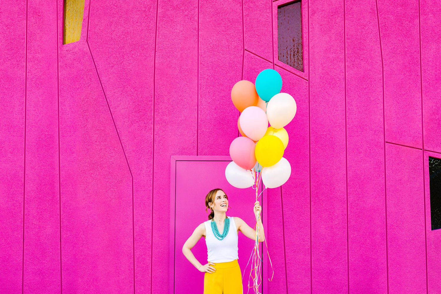
When you’re ready to pump things up a notch, use a vivid backdrop to incorporate even more color in your shoot. I love using a single-color paper backdrop for a clean and modern take on headshots. I also love to find colorful and textured walls while I’m out and about.
When I’m looking for colorful walls, I typically keep an eye out for solid colors, clean lines and backdrops that aren’t super busy so that my subject can stand out. When using colorful backdrops, just make sure that you plan your (or your client’s) outfits ahead of time, so that you know that colors will complement, and not clash.
Getting color confusion? Look for colors on the opposite side of the color wheel, so that they’ll contrast with each other nicely!

—
You are now on your way to creating the vibrant, joyful and unmissable photos of your branding dreams! If you’re in need of a bit of extra inspo (or just some pretty photos), feel free to download my free San Francisco Color Guide here!

Comments +